CITIZENS FOOTBALL CLUB
Citizens Football Club is rebranding of the current D.C. NWSL team, the Washington Spirit. The project aims to create a unique identity that’s immediately recognizable as “D.C.” to residents of The District.
You can view the original brand presentation here.

CITIZENS ALL
While D.C. may play host to nations capitol, there’s so much more to the city than that. Comprised of a diverse populace of transplants, immigrants, and lifelong residents, The District is the type of melting pot in which the beautiful game can’t help but thrive.
The Citizens brand was designed to move away from the nationalistic, and patriotic feel of its predecessor, in order to create an identity that prioritized the elements of the city that go beyond politics. Using the iconic cherry blossom as its central feature, the Citizens brand is for all who call D.C. home.


DESIGNED FOR THE DISTRICT
-
The Citizens identity was created as part of a larger class project in which I worked as part of a team to overhaul the marketing and branding of the D.C. NWSL team. I worked primarily on the visual Identity of the club.
When tasked with creating a new identity for the D.C. NWSL side, I knew immediately that I wanted to pivot from “patriotic” to something more indicative of the city as a whole.
At first the idea was to utilize the D.C. Metro as inspiration, and the idea of naming the team the “Metropolitans” became a leading idea. As I played with the idea, I ran the idea by teammates I was working with on other elements of the project, and through a few discussions, we settled on the “Citizens” name. It felt like a more impactful version of the Metropolitans idea, and really resonated with the identity I was attempting to create.
From there I began to index D.C. Icons, and eventually landed on the cherry blossom as the primary icon for the club, as the flower is heavily associated with D.C. and the idea of regrowth and renewal that our team was going for as we worked on repositioning the club.
-
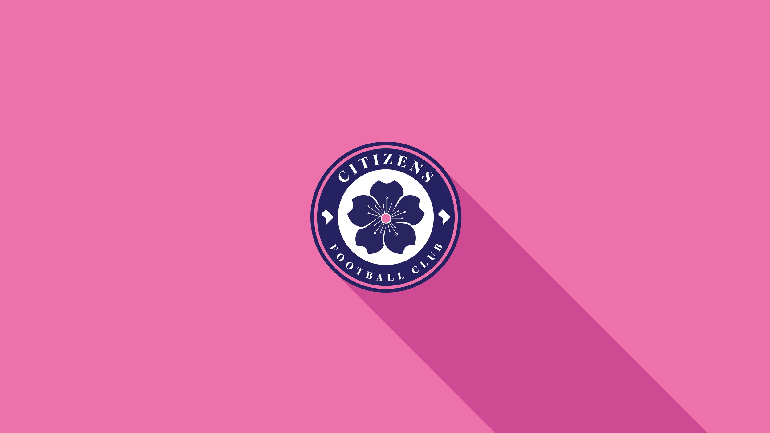
The primary mark was designed to be two things, instantly recognizable as a soccer mark, and instantly recognizable as belonging to D.C. For those reasons, it was obvious to place the primary symbol of the cherry blossom in the middle of a classic soccer crest.
The cherry blossom consists of five navy petals, a pink center stigma, and white anthers radiating from the center of the flower. While the original idea of a badge that paid homage to the Metro system was abandoned, the anthers that come from the center of the blossom were designed to evoke some of the imagery often associated with the Metro.
Moving on from the central flower, the badge takes on a very traditional soccer styling, with the club name present at the top of the badge, and the “Football Club” signifier along the bottom. The text is in the font “superior title”, a choice that was made to emphasize the regal nature of the club, and allow some connection to the diplomatic elements of D.C.
Completing the badge are the two outlines of D.C. that fall in the midpoint of the enclosing circle. This spot is traditionally reserved for either a founding year, or important club or city iconography, and nothing felt more fitting than giving a direct nod to the unique location of the club.
-
In addition to the primary mark, the Citizens Identity has a variety of secondary and tertiary marks for use within their branding and marketing.
All marks aside from the word marks always utilize the cherry blossom in some way, with a simplified version of the blossom being used in combination with the “‘Zens” nickname for the club.
The nickname is derived from the tradition of shortening D.C. team names (‘Zards, Caps, Nats), and helps gently nudge the fanbase in the direction of a nickname that feels natural to residents of The District.


